Week 2 - Graphic Design 101
Overview
This week, we start exploring some of the principles of graphic design as they relate to software design. We will extend the concepts presented in The Non-Designer's Design Book with some general rules. As with any rules, we will also discuss when to break the rules.Assignments Due Today
- Make sure InDesign is installed on your laptop. Illustrator is an okay substitute, if need be.
- Read http://www.markboulton.co.uk/journal/visual-design-is-not-a-thing
- Read pages 1-80 of The Non-Designer’s Design Book
- Bring an example, printed out, of something that is visually pleasing. Bring an example of something that is not.
- Read http://www.visualmess.com/
Class Activities
One More Process Example (~10 minutes)
So that you have another example, we'll walk through, briefly, the design process we use at Involution and look at some examples of design artifacts.Group Activity: Discuss What We Think Makes Things Visually Appealing (~20 minutes)
In your groups, discuss the screenshots you brought in. What makes them visually appealing? What makes them visually appalling? Think about the Consistency, Repetition, Alignment, and Proximity that was presented in the reading. Present one as a group.Activity Results (Hide All Results)
In this discussion, we went through the examples students brought in. We found that many of the "visually pleasing" examples that were shown are actually relatively simple websites without much content (for instance Apple's website or Coin's website). Another example was a GNU command line manual, which presents information very succintly but does not actually look very nice.
Instructor Analysis (Hide Instructor Analysis)
This discussion went pretty well. I made the mistake of not requiring students to bring in examples of screens (In fact, I explicitly said that it didn't have to be software). This cause some issues because we were trying to use some of the more software based principles to judge photos. It was also helpful to have some examples prepared myself.
Lecture: Achieving Structure and Visual Hierarchy (~30 minutes)
Structure and Visual Hierarchy are two of the most important principles when designing software. We will build on the topics from the reading and go through a handful of examples and rules.Activity Results (Hide All Results)
Instructor Analysis (Hide Instructor Analysis)
This lecture went pretty well. I think there was a good balance of examples and rules of thumb. I wish I had gotten into a few more software based principles (such as drawing attention towards actions we want to take).
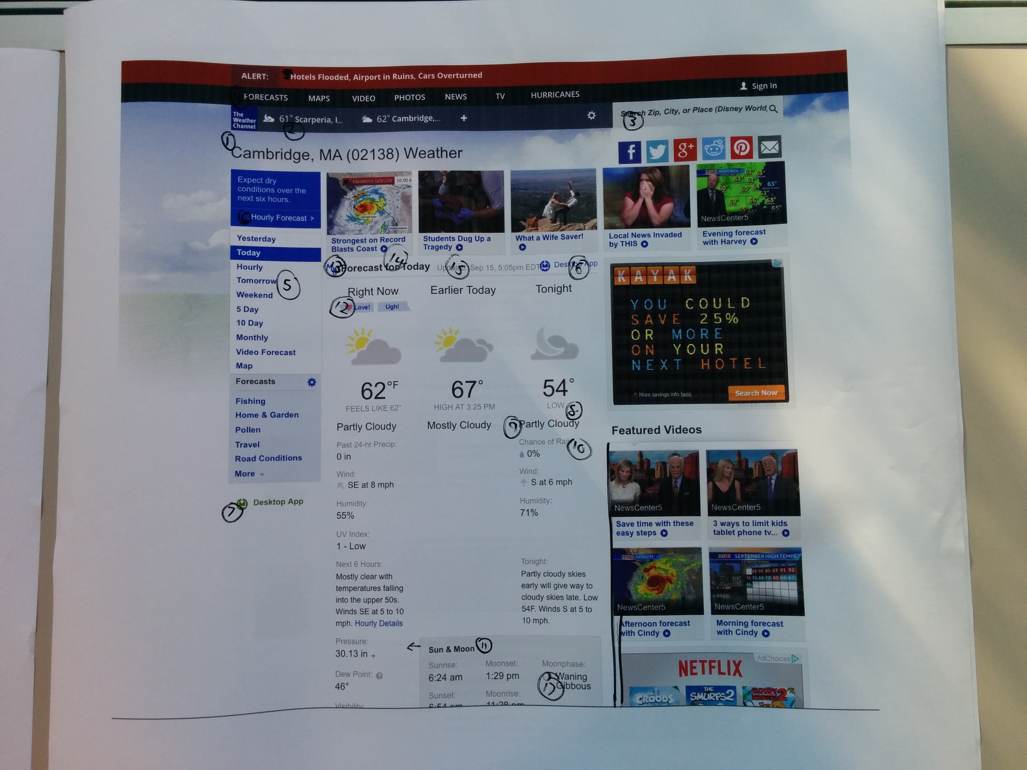
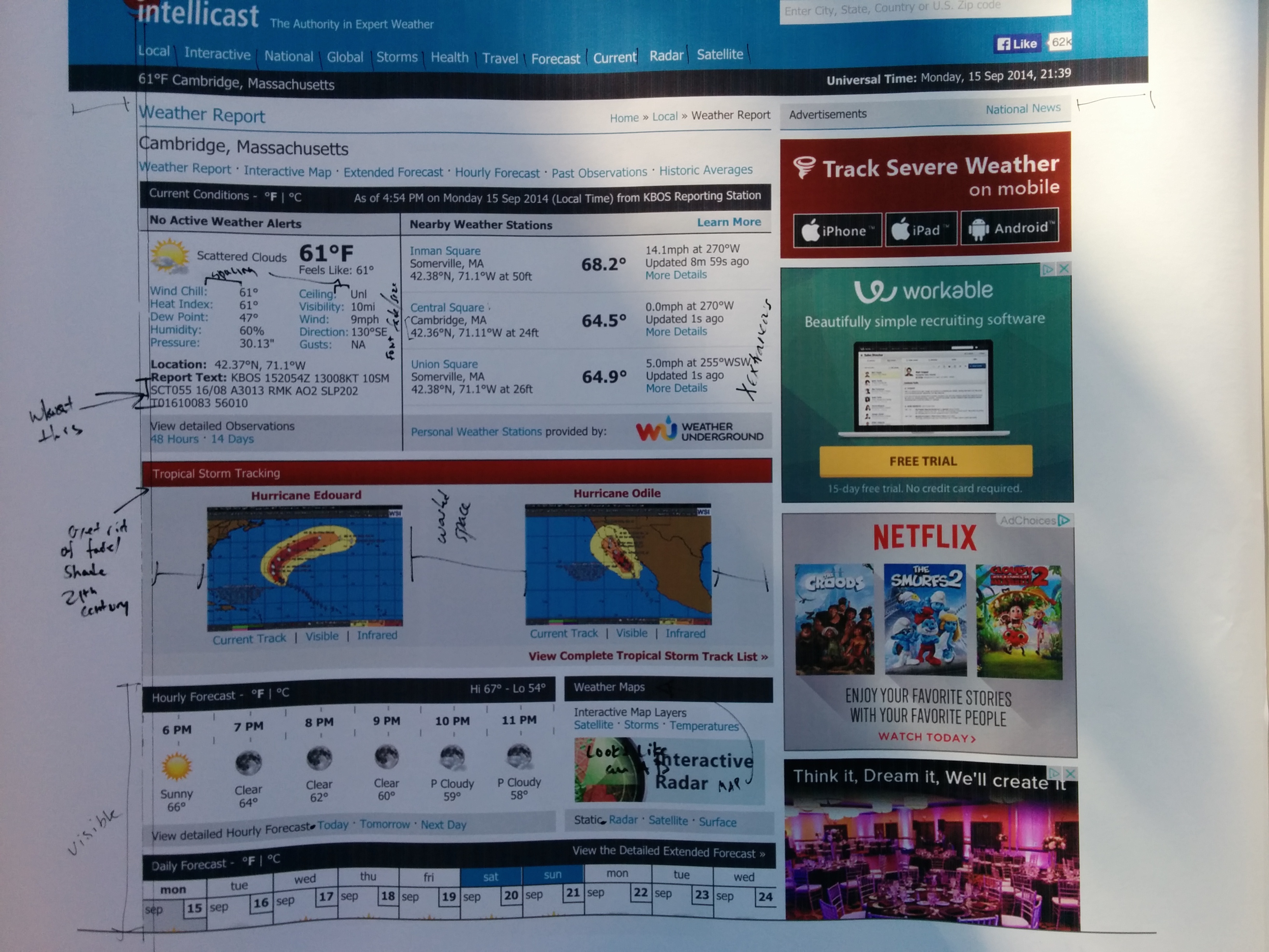
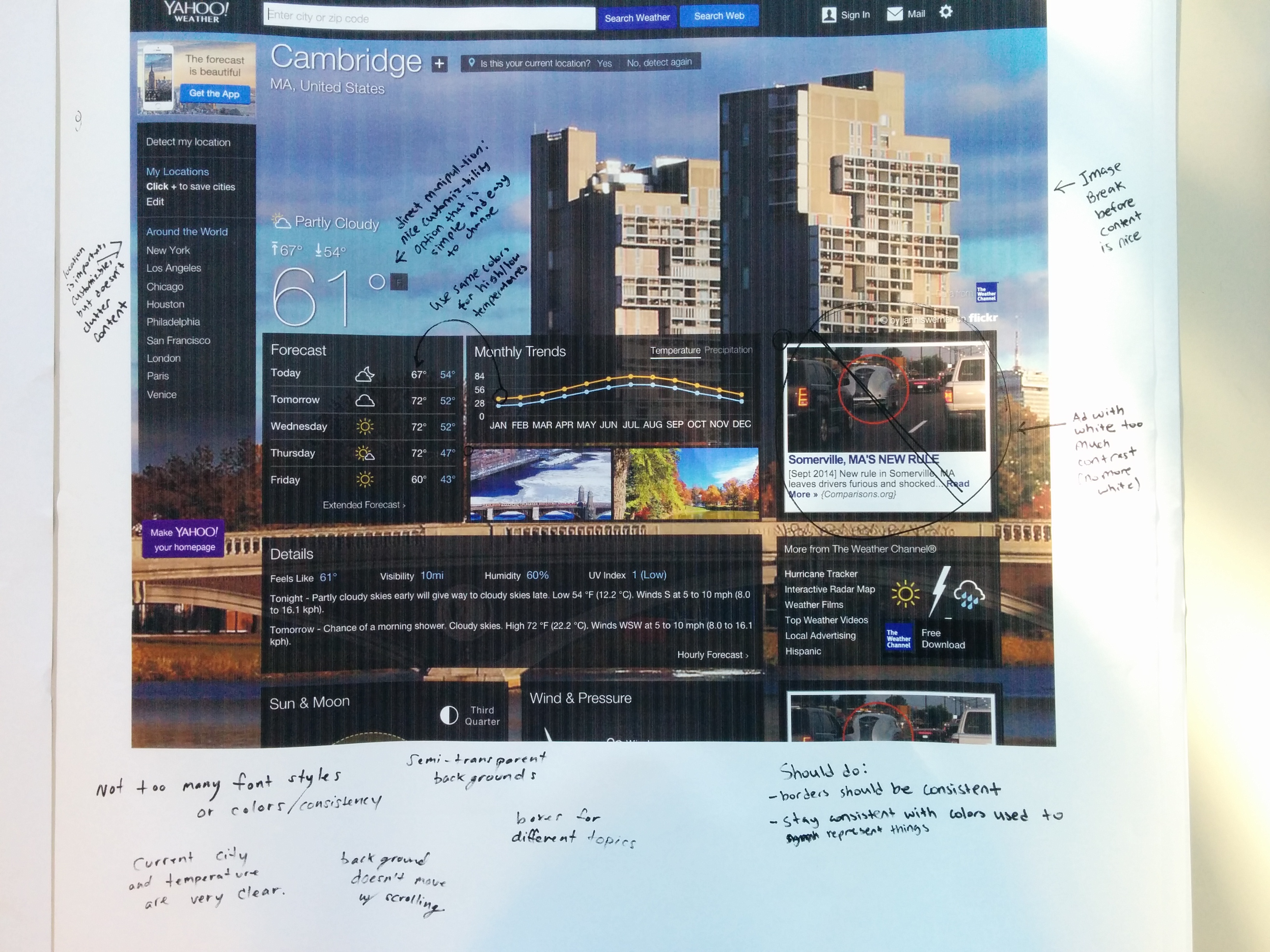
Group Activity: Critique a Screen (~30 minutes)
Each group will be given a web site and a large printout of a particular screen. Based on the lecture, make suggestions of how to improve the design.Activity Results (Hide All Results)
Different groups of students took different approaches to this discussion. All together, most students cited the lack of visual hierarchy in the examples. Likewise, alignment and the overuse of fonts came up quite a bit. There was also a common thread about how the ads on a screen often fight for the attention.
Instructor Analysis (Hide Instructor Analysis)
This exercise went quite well. It gave students a chance to practice some of the techniques we had discussed. I think it was good to print out the screens on large paper (24in x 24in).
Assignments Due Next Week
- If you haven’t used InDesign/Illustrator before: watch https://www.youtube.com/watch?v=JfhHvAscNFA
- Take the example screen you had at the end of class and translate a portion of it into InDesign or Illustrator. Get familiar with the basic tools presented in the above video as we will be using InDesign in class next week
- Read Chapter 7: Using Color of The Non-Designer's Design Book
- Read about Typography in Chapters 9-11 of The Non-Designer's Design Book